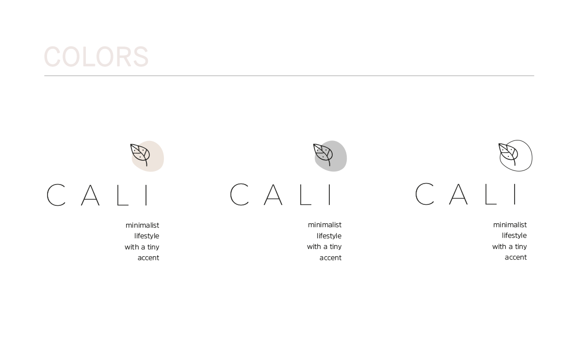


CALÌ DESIGN
Design logo + Brand Identity
Client
Blogger
Target
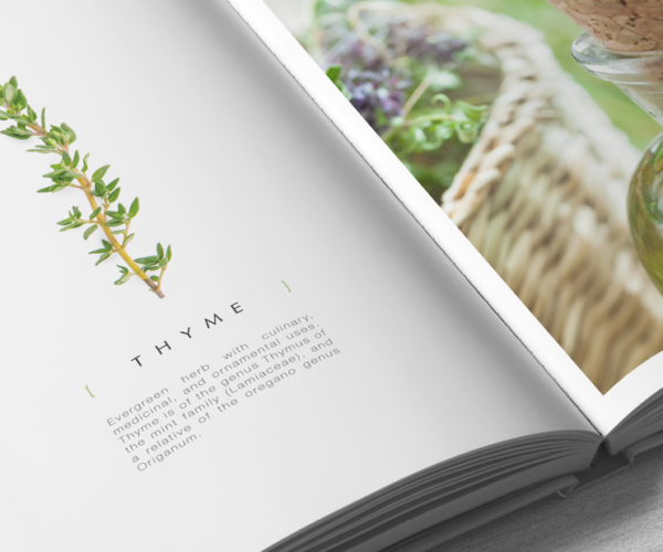
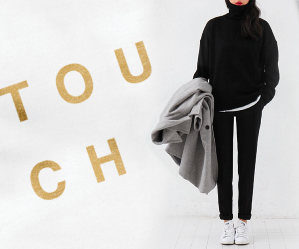
Design – Photography – Lifestyle – Minimalism
Calì represents a new concept of minimalism, eclectic, warm, alive.
The logo embodies this story.
Design Logo
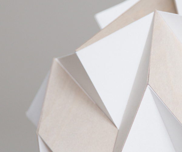
The extra light lettering symbolizes order and synthesis, like a delicate and meditative abstraction leading back to the essential structure of things.
The leaf (the accent) soft and moving, embodies vital energy, continuously changing and in evolution. It becomes characteristic of the uniqueness of each event, reflection and/or new awareness.
The organic shape, closely connected to the leaf, is the creative environment of its origins. Meant both as thought and physical space.
The payoff organized as a column below, balances the poles. As the creative thought leads upwards, to the same extent in its opposite dimension, it finds its roots.
LUT’S for Photoshop
Creation of custom photo filters for blog images. Includes lights, saturation and shades that match all brand identities and defines their moods.
Sito Web
A space sharing his ideas of philosophy through images and food for thought.
Calì Design